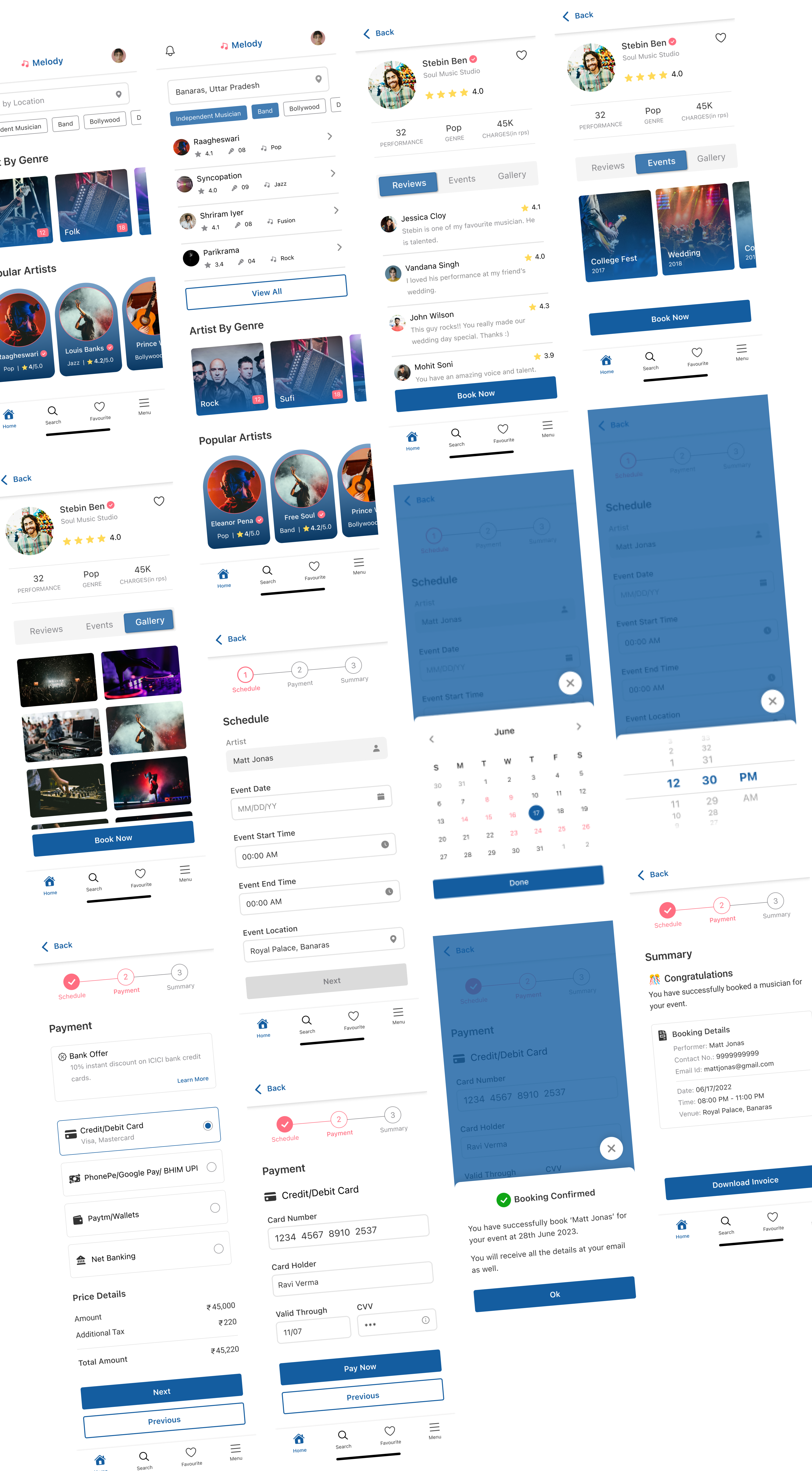
Melody Mobile App: a UI UX case study
Brief:
When talking about celebrations, the first thing that comes to our mind is Music — Music that will cheer-up all the people in the event and make it memorable. Music for your event is not only used as a form of entertainment, but it also sets a scene, creates a mood or atmosphere, brings people together and encourages participation. Arranging a musician or band for the event, be it your D-day or house party or for your loved ones, celebration can be a tiring process. The problem increases for people searching for the musicians in a city different from where they live.

The problem:
Users don’t have time to search and book musicians for their events at their preferred location.
The goal:
Our musician booking app will let users search and book verified musicians which will affect users who want to view different musicians or bands at their choice of location.
My role: UI UX Designer
Tools: Figma, Miro, Zoom
Target Audience: users from age 20–65
Project Duration: 3 weeks
Key Challenges:
- Going through every usability test results and design iterations in such small time was a major challenge.
- Finding relevant participants online for usability testing in covid situation was challenging.
The Design Process
User Interview:
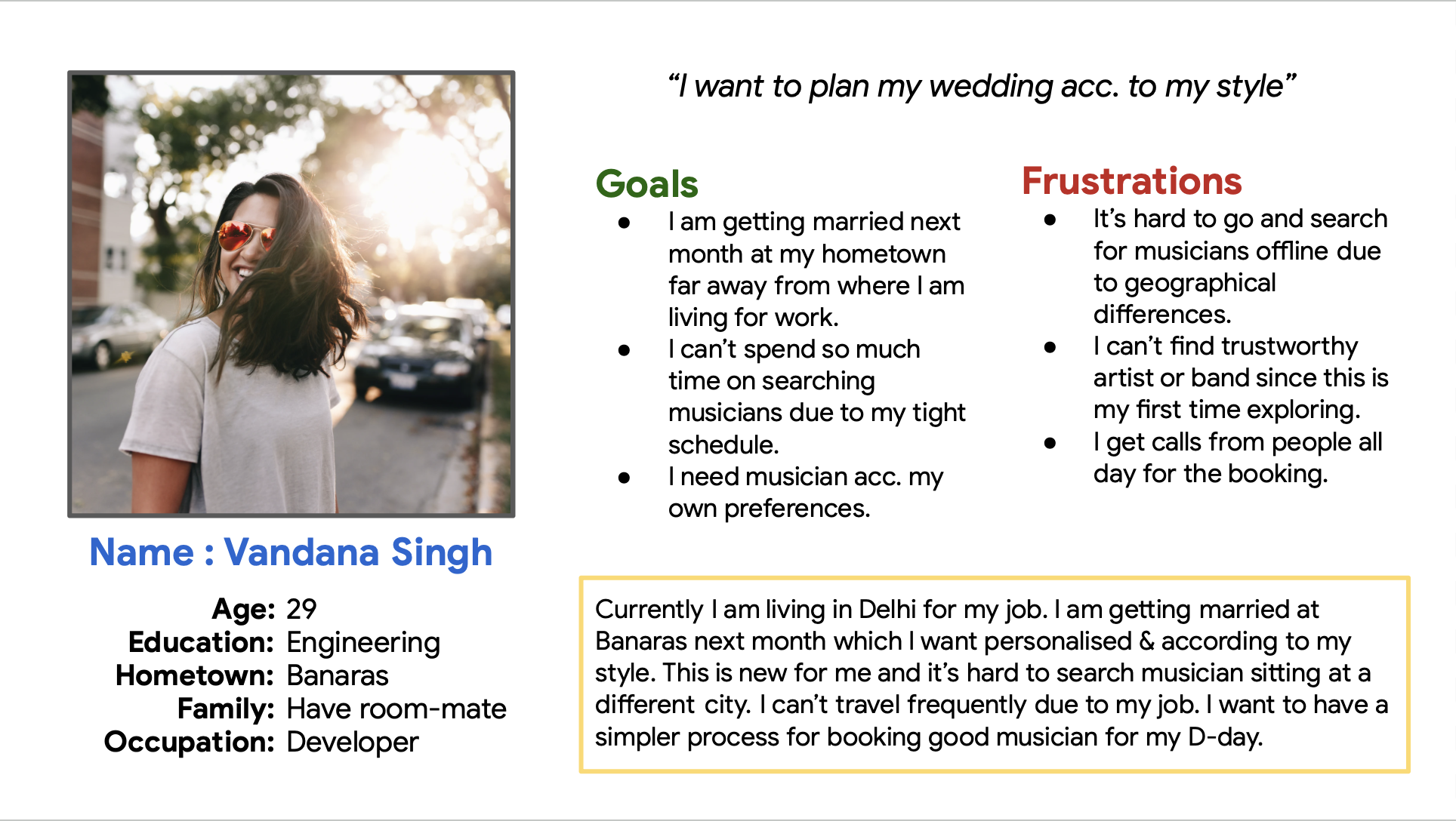
Participants included independent people who were about to get married, young students looking for musician for their college fest, older people who usually handles wedding arrangements for their children. Key quotes from the target audience: “I don’t the time to travel my hometown to arrange a music band for the event.” “I don’t know any musician or music group who performs in my city. It’s important for me to book a verified performer whom I can trust for the D-day.” “My life will become easier if I could select few musicians and compare them according to my requirement.”
Persona:
After interviewing users, I created two personas for my design.
User Journey:
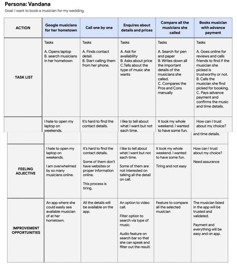
I created user journey map to uncover the frustration and delight that user goes through.
DEFINE
Competitive Audit:
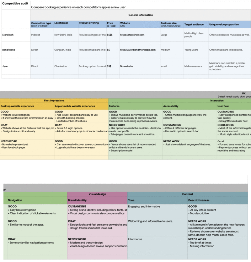
I examined my competitors’ features, pricing, differentiators, strengths, weakness and competitive reviews, etc. This helped in understanding what is already there and what needs to be added to solve the problem user is facing.
Storyboard:
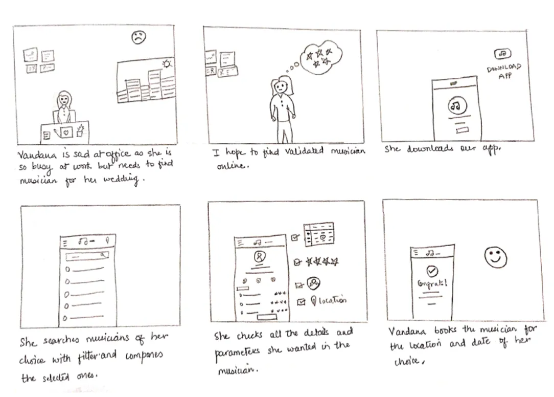
With all the insights from research in previous phases, I created storyboard to illustrate user experience in their context to get a better understanding of what can be improved and how I can make user’s life better.
Wireframes:
With all the information gathered, I started sketching wireframes on paper. Once I felt good enough, I created digital wireframes on figma. This gave me a rough idea of how my design would look like and what more can be improved.
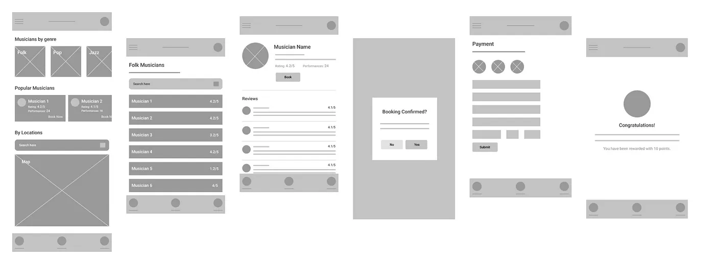
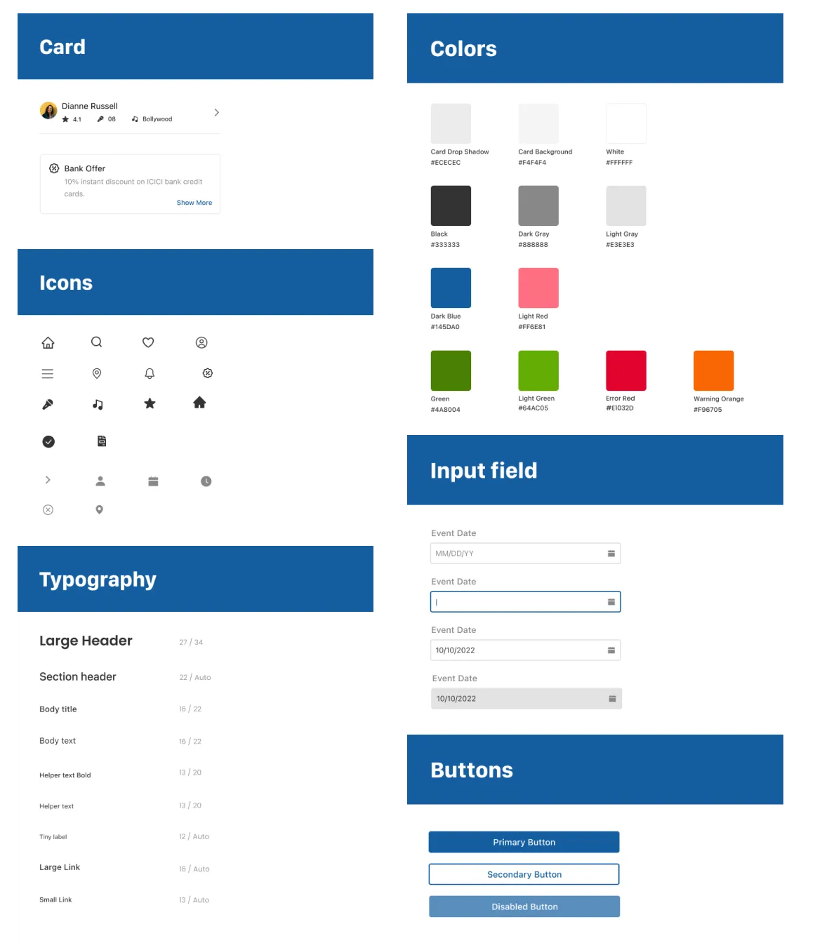
To make sure that the I was going on the right track, I went for an unmoderated usability testing with the participants selected earlier. This resulted in iterations in my design screens since there were many gaps in the flow that didn't came to my mind until then. I created a cheat sheet for my prototypes which made my design work faster and easier.
Prototypes:
