True Energy: a UI UX case study
Brief:
EV (electric vehicle) charging is becoming increasingly vital as EV adoption accelerates globally. Its significance extends across multiple domains, including environmental sustainability, economic benefits, energy management, and technological innovation.
EV owners appreciate the convenience of home charging but struggle with managing costs and optimizing their energy use. Public charging presents challenges with availability, costs, and app fragmentation.
Business Objective:
A unified app that addresses these pain points—such as combining cost management, renewable energy optimization, and seamless home-public integration.
Project Type: UI/UX
My Role: Lead UI UX Designer
Design Team: 1 lead UI/UX designer, 1 junior UI/UX designer
Tools: Figma, Jira, Zoom, Adobe Illustrator, Miro
Domain: EV
The Design Process:
The design process provides a structured approach to problem solving, ensures that products and services meet user needs, and helps align team efforts with business goals.
The design process I followed is Define → Design → Refine

DEFINE PHASE
The define phase is all about understanding the problem. This stage entails determining the project's aims and objectives. Understanding every aspect of our consumer and identifying the issue is the primary goal of this phase, which enables us to begin brainstorming solutions.
User Interview:
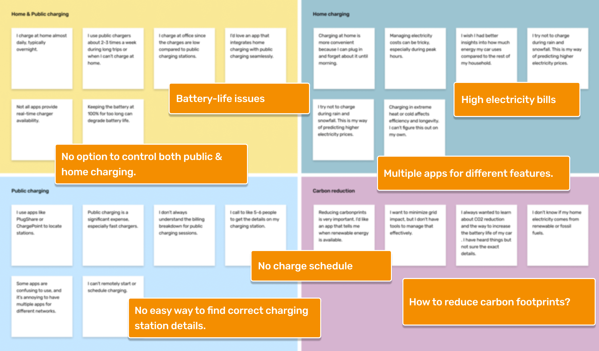
Participants: 5 users on video call and 1 user face-to-face. Some were EV owners who charged at home, while others were frequent public charger users.
Goal: Understand how EV owners manage home and public charging and identify pain points in the experience.
User Personas:
We analyzed the data from user interviews. This gave us our user personas.
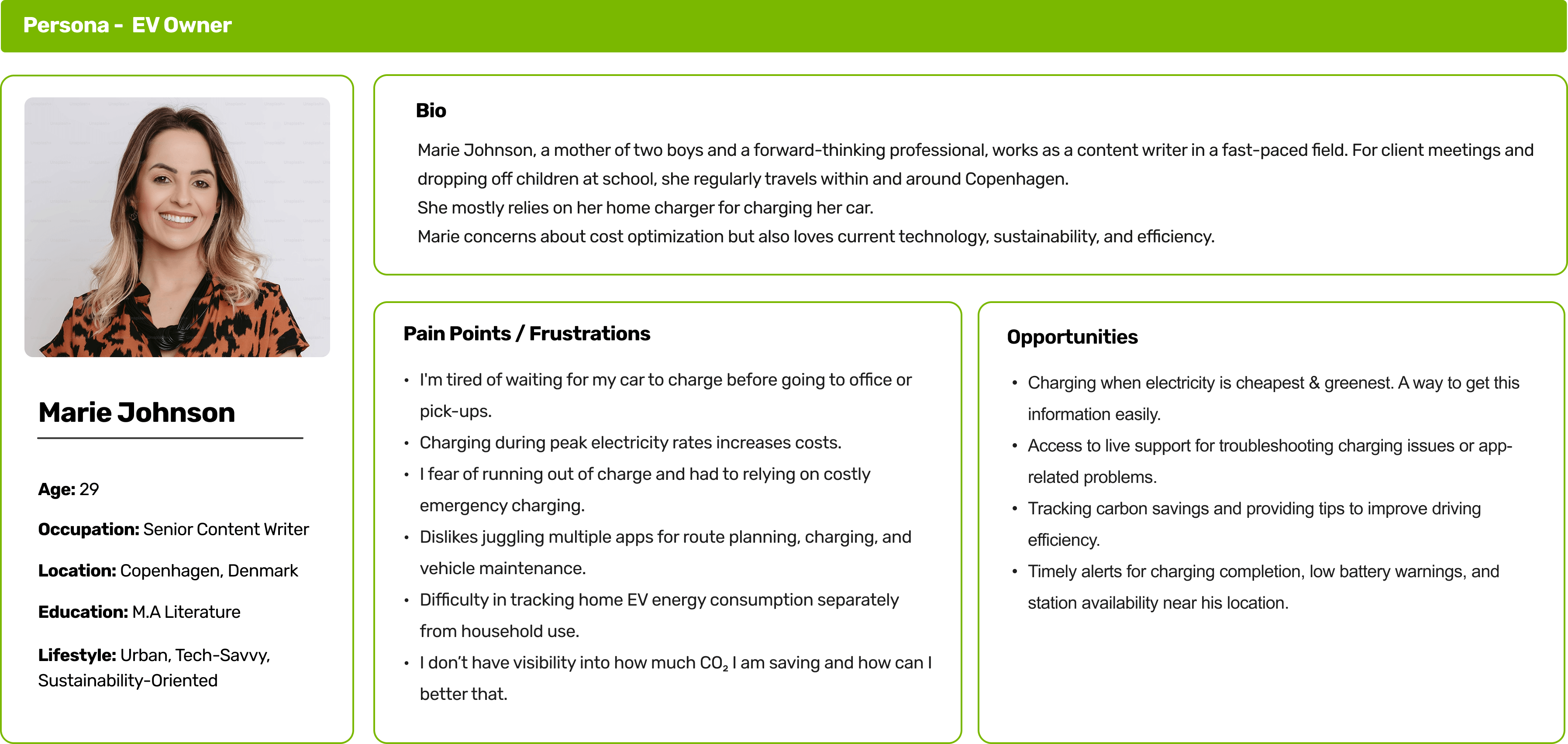
Persona 1 - EV OWNER
User who mostly uses charger at home.
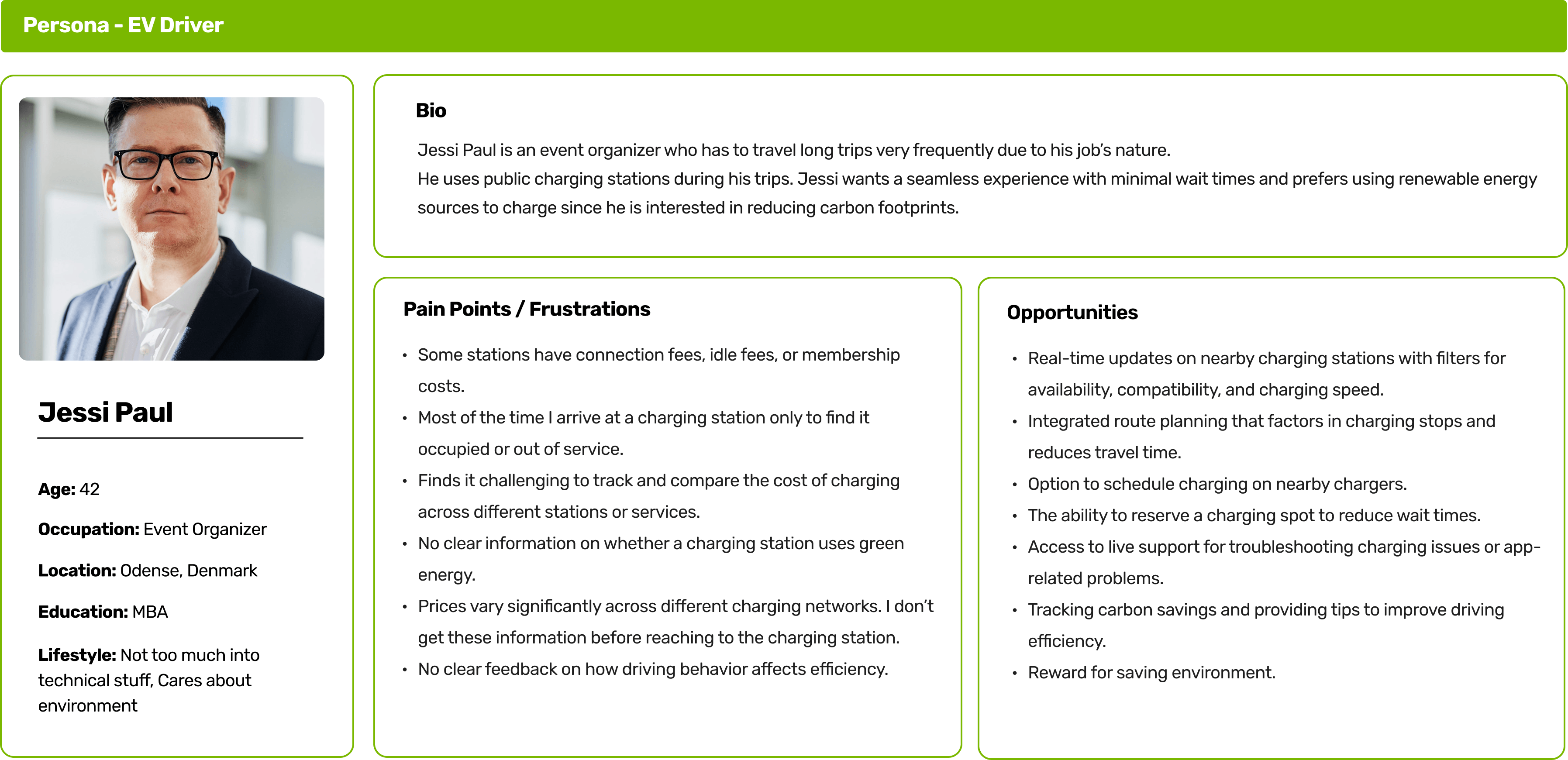
Persona 2 - EV DRIVER
User who uses public chargers frequently.
Storyboarding:
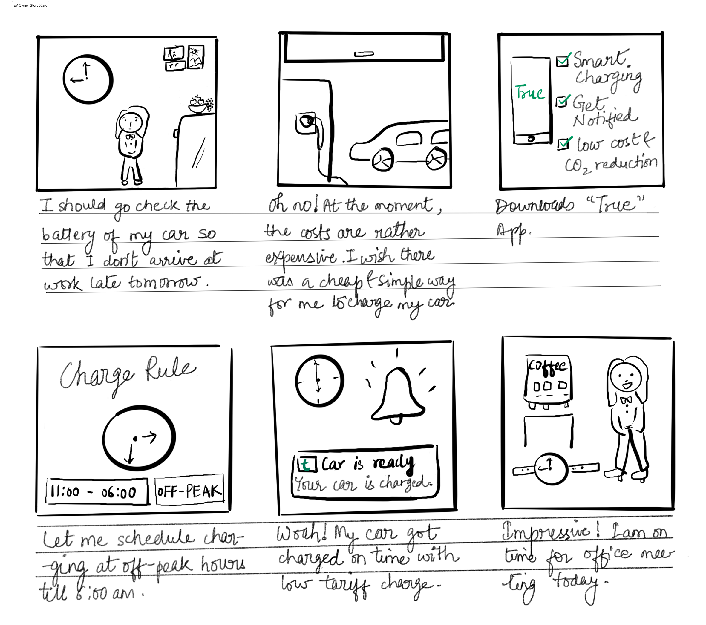
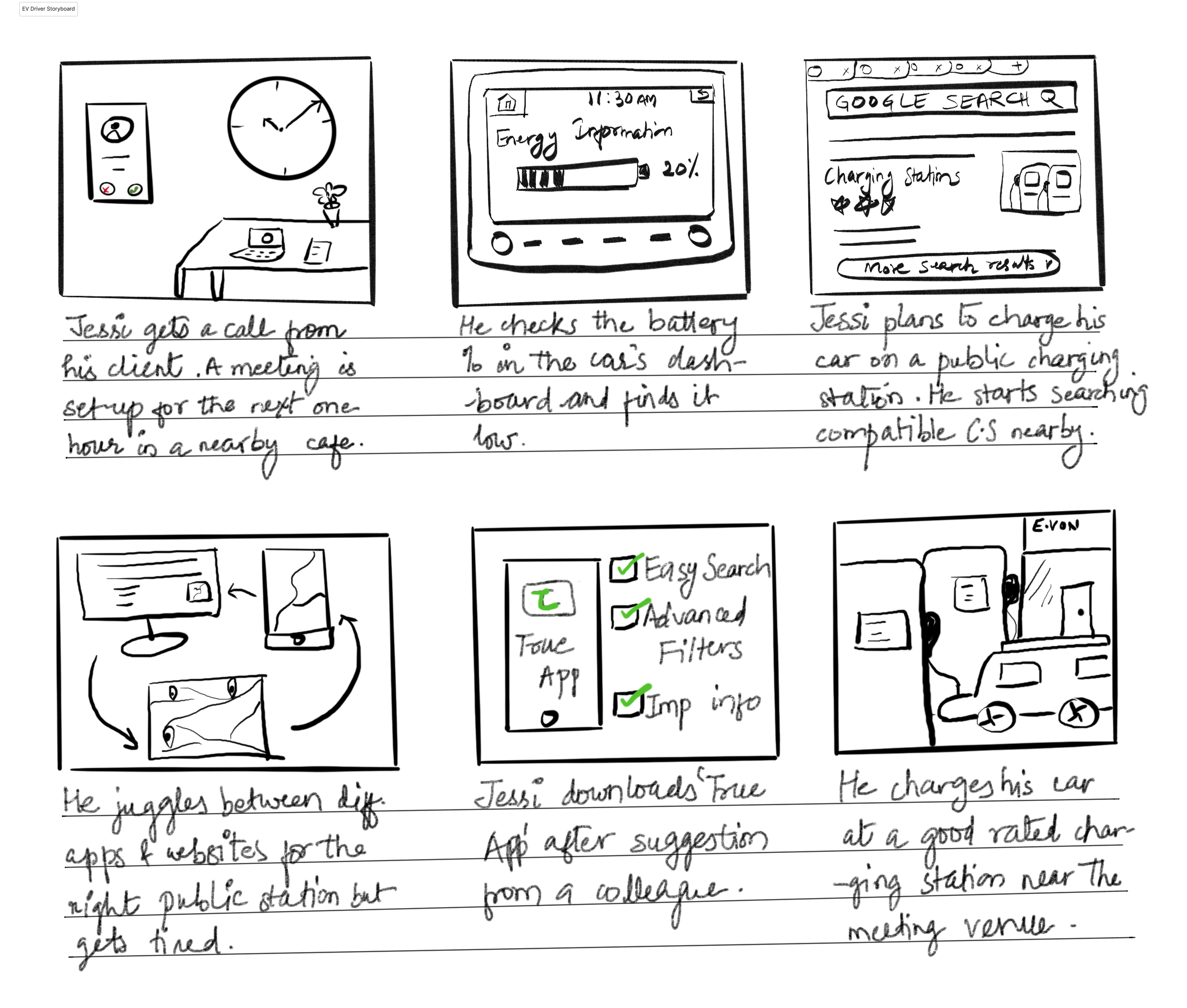
We made storyboards for both personas in order to better understand our users. This provided us with a visual representation of how users engage and accomplish their tasks, as well as the difficulties they encounter and their feelings in every given situation.
Persona 1: EV Owner
Marie represents EV users who have installed chargers at home for easy charging access but struggle to optimize electricity costs and reduce manual work in their charging journey.
Persona 2: EV Driver
Jessi represents urban EV users who depend on public charging but face availability, pricing, and convenience issues.
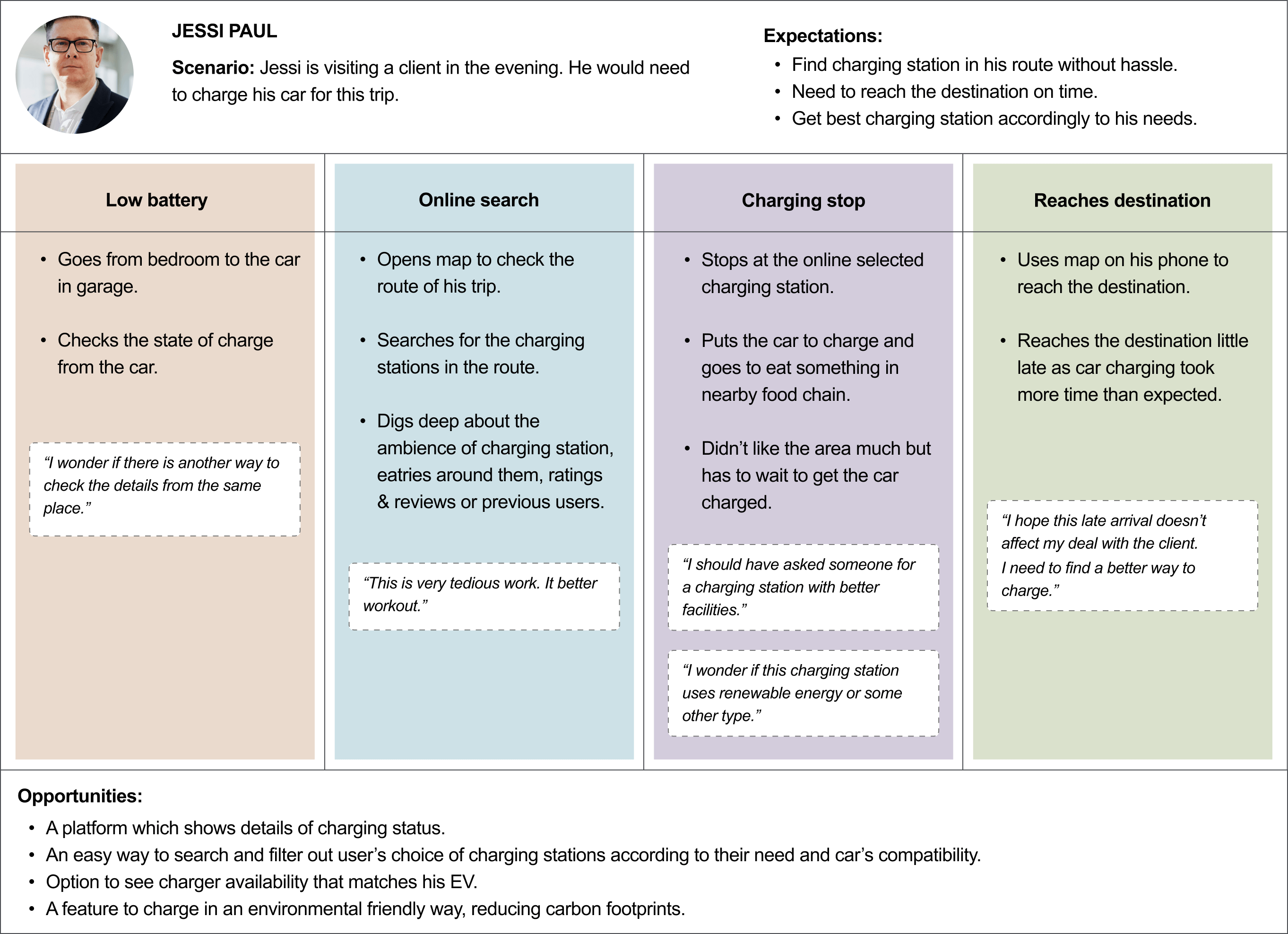
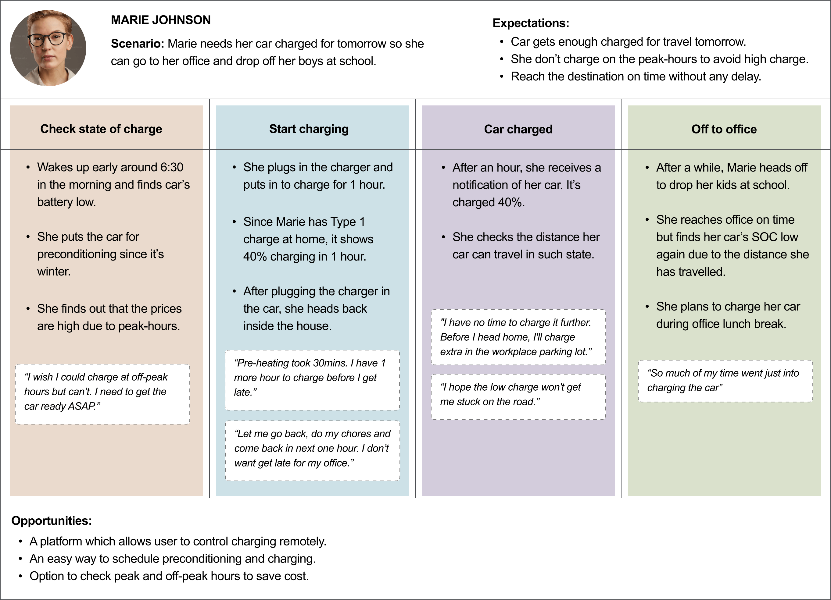
User Journey:
As a consequence of his travel career, I began to understand the user paths of Jessi Paul, a Danish EV owner who primarily uses public charging stations, and Marie Johnson, an EV user who owns and uses a charger the majority of the time.
Competitive Analysis:
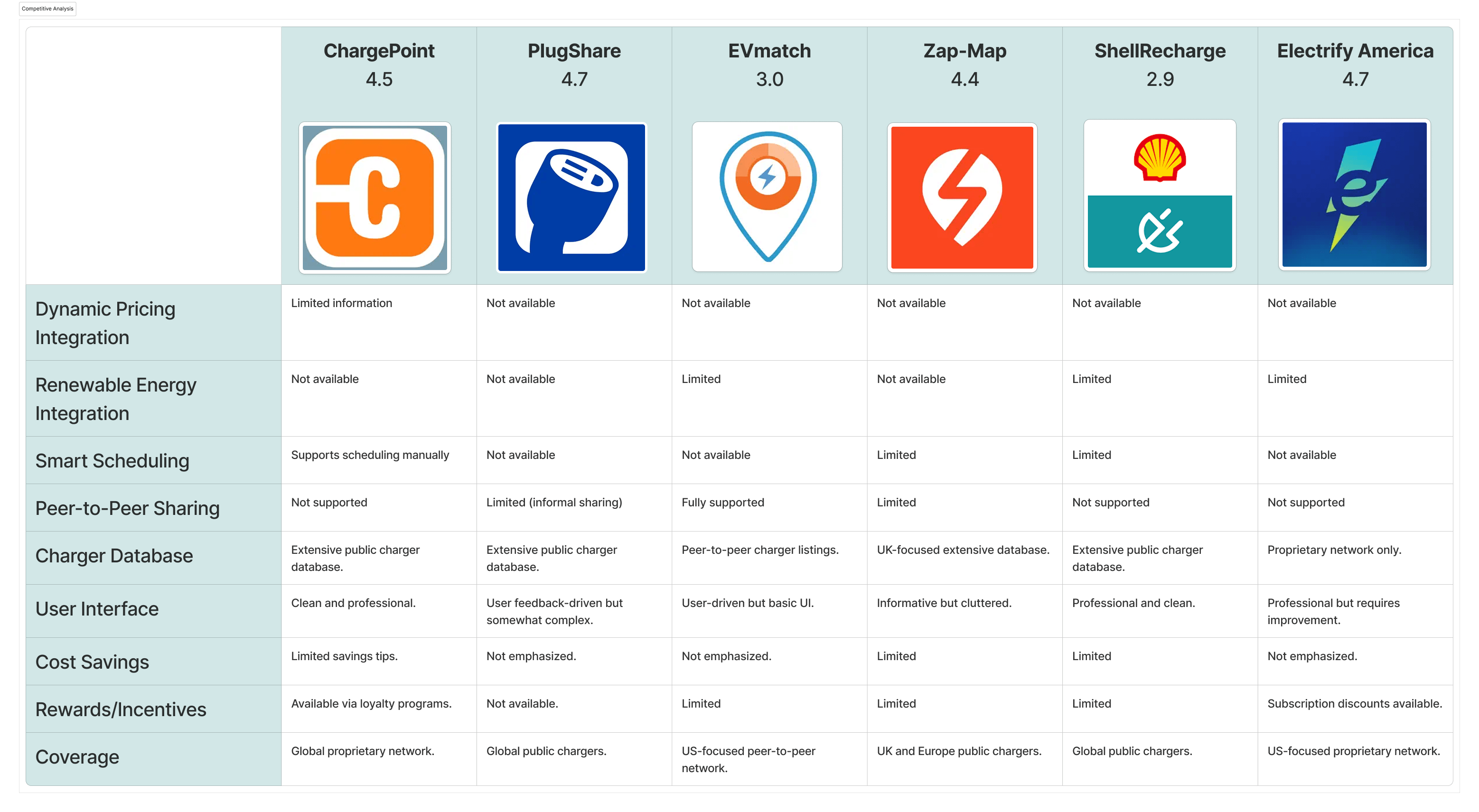
The below table compares key EV charging apps in the market, analyzing their strengths, weaknesses, and opportunities for differentiation. The goal is to identify gaps and create a competitive edge for a new EV charging solution.
We also went through the user reviews on the competitor's app to see what the user is currently facing and what they like.
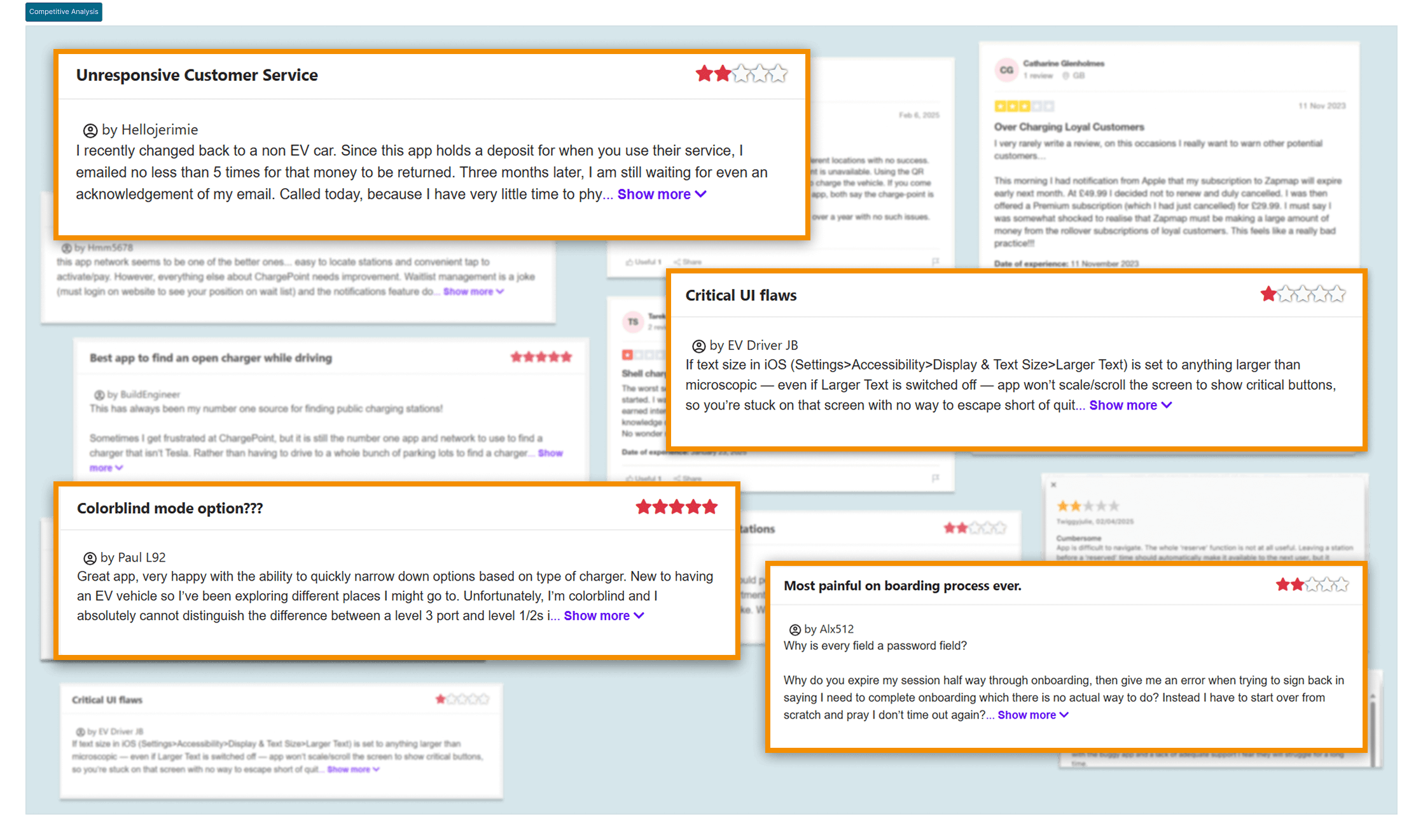
Through competitive analysis, we learned how the users were feeling about the solutions that were in the market. This helped us in creating opportunities to make user’s experience better.
Ideation:
We constructed “How Might We” questions to generate creative solutions.
Insight #1:
Users lack trust in charging station availability.
Insight #2:
Poor customer support in EV apps leads to user frustration.
Insight #3:
Lack of visibility into green energy charging options.
Insight #4:
Users want personalized notifications.
Insight #5:
New EV owners struggle with unfamiliarity.
Insight #6:
Users rely on community feedback for charging stations.
UX review call:
Based on the findings of user research, we began making a list of features. We received a request during our UX call with the stakeholders to include a feature called "Home devices," which would allow users to install and control smart devices such as pumps, thermometers, heaters, and other household appliances.
This was later removed while prioritizing features using MOSCOW.
Information Architecture:
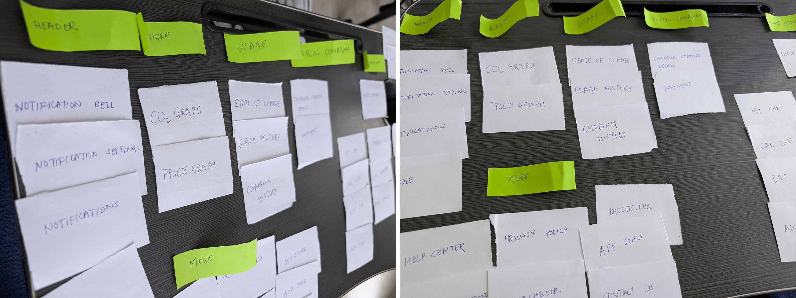
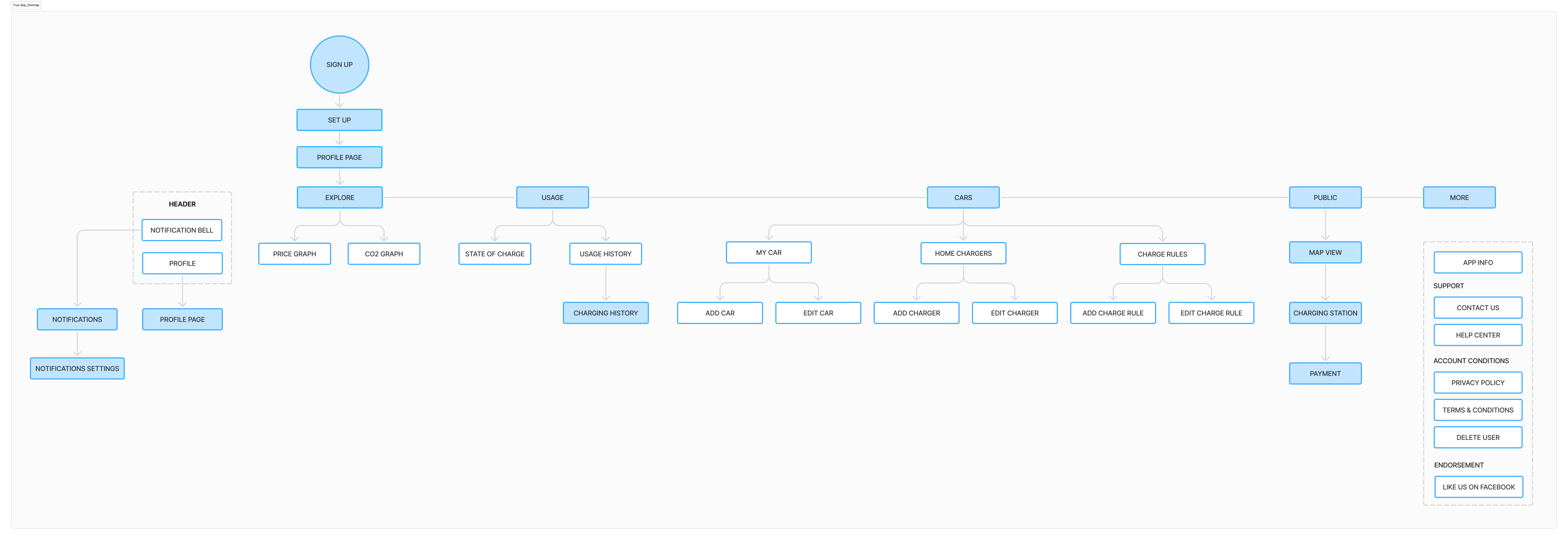
Six people participated in our closed card sorting activity. We made an effort to identify the categories for our primary application. In order to ensure that people understand the words and find it intuitive, this also involved reviewing the label contents.
User flow:
After getting approvals on the sitemap from our stakeholders, we worked further on figuring out the user flow for particular features.


DESIGN PHASE
This phase is all about creating designs based on the data we collected in our define phase.
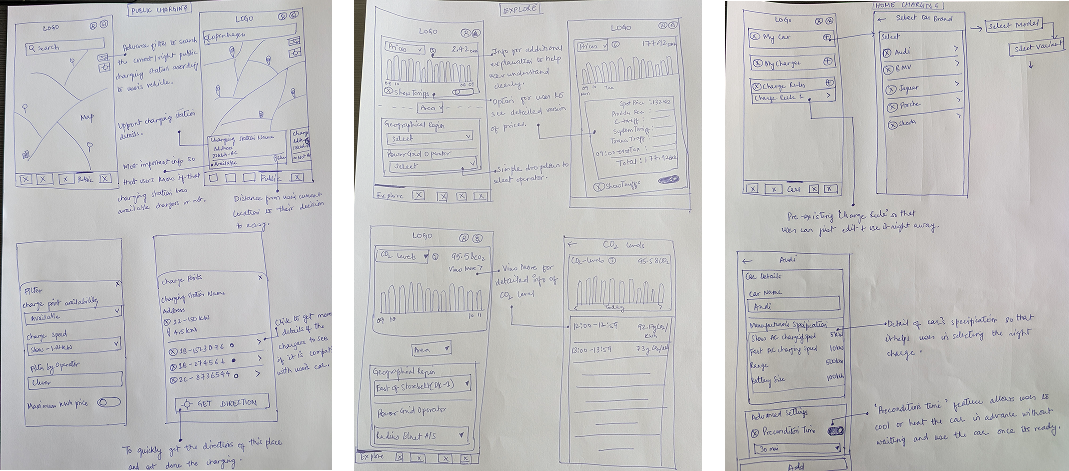
Wireframing:
We started with lo-fi wireframes on paper. Since we had our design system, exact UI patterns were not the concern.
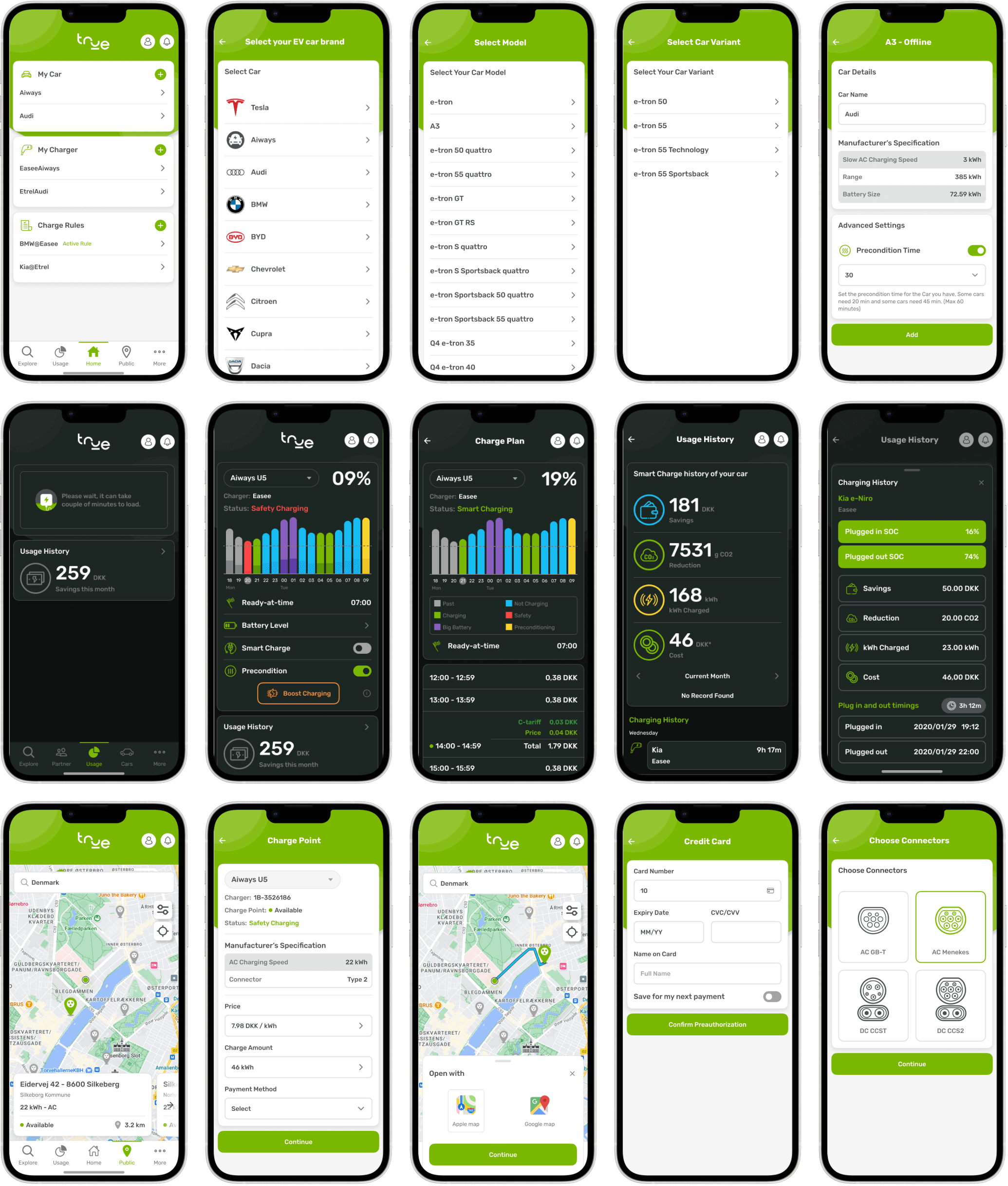
Visual Design:
After several iterations and discussions on the wireframes, we started working on the visual screens.
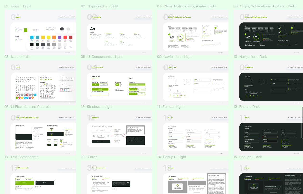
Design system:
We used our design system to ensure consistency across all other products of the company. It also helped us in creating a unified language within and between cross-functional teams.
REFINE PHASE
In this phase, we collected feedback from our users using usability testing. List were made of what to implement now and park for future after discussing with the stakeholders. All that feedback was incorporated in the design screens.
Once we got the final approval from the stakeholders, designs were shared with the dev team.

KPIs measured:
User Satisfaction – We got positive feedback scores from surveys and app ratings.

User 1: Charged 626 kWh and saved 904 DKK, reducing CO₂ emissions by 7 kg.
User 2: Charged 154 kWh and saved 226 DKK, reducing CO₂ emissions by 3 kg.
Learnings from this project:
a) From the competitive analysis and understanding the user’s point of view it’s clear that a successful EV app must focus on real-time data, interoperability, smart reservations, and cost transparency.
b) The features list may grow lengthy as we go more into user research. We must currently prioritize the items based on the demands of our users and our business goals. Having a lot of functionality can overwhelm the user.
”MVP first, then scale with advanced optimizations”
c) Sometimes the stakeholders may want to choose the options that appear best to them, but we can support our designs with statistics and provide them to them at the beginning of the walkthrough to cut down on pointless iterations.